Boost Your Conversions: 8 Essential Components of an Effective Sales Page

As a business owner, your website’s sales page is your digital storefront. Here are the crucial features that make a sales page truly effective:
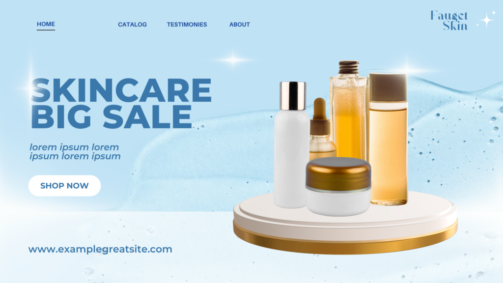
1) Clear, Compelling Headline
Explanation: Your headline is the first thing visitors see. It should quickly communicate your main offer or value proposition. A good headline grabs attention and makes people want to read more.
Example: “Super Sale 50% off!”
2) Engaging Visuals
Explanation: High-quality images or videos help break up text and make your page more appealing. They can demonstrate your product, show happy customers, or evoke emotions that support your message.
Tip: Use authentic photos rather than generic stock images when possible.
3) Persuasive Copy
Explanation: Your text should focus on how your product or service benefits the customer. Instead of just listing features, explain how those features improve the customer’s life or solve their problems.
Example: Instead of “24/7 customer support”, say “Get help anytime, day or night, so you’re never left struggling alone”
4) Social Proof
Explanation: Testimonials, reviews, and case studies show potential customers that others have had success with your product. This builds trust and reduces perceived risk.
Tip: Include specific results or quotes from real customers, with their names and photos if possible.
5) Clear Call-to-Action (CTA)
Explanation: Your CTA tells visitors what to do next. It should be prominently displayed, easy to spot, and use action-oriented language.
Example: “Start Your Free Trial Now” or “Shop Now”
6) Mobile Responsiveness
Explanation: With more people browsing on smartphones, your sales page must look good and function well on all screen sizes. This ensures a good user experience for all visitors.
Tip: Test your page on various devices to ensure it’s easy to read and navigate.
7) Fast Loading Speed
Explanation: A slow website can frustrate visitors and cause them to leave before even seeing your offer. Aim for a loading time of 3 seconds or less.
Tip: Optimize images, minimize code, and use a reliable hosting service (like NetKL!) to improve speed.
8) Trust Indicators
Explanation: Security badges, money-back guarantees, and privacy policy links help visitors feel safe doing business with you. They reduce perceived risk and increase confidence in your offer.
Example: Display SSL certificates, industry awards, or “100% Satisfaction Guaranteed” badges.
Need help crafting the perfect sales page? NetKL offers professional web design services to complement our hosting and domain solutions. Let’s turn your visitors into customers!
Contact NetKL’s Webdesign team here : https://m.me/netkl today, and request for webdesign quote for your dream Sales Page site! 💻🛒💯


